K-Bar / @kbar.design: Where Graphic Design Gets a Sense of Humour
- Mar 10
- 2 min read
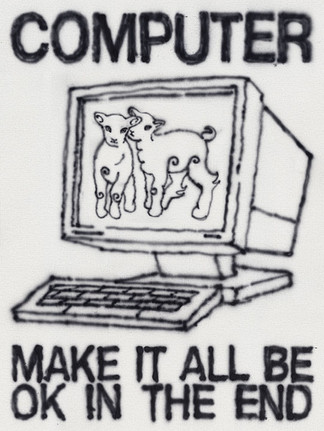
Scrolling through @kbar.design feels a bit like encountering graphic design with a punchline. The work of illustrator and designer Alex Khabbazi (the mind behind K-Bar) sits in that sweet spot where sharp visual communication meets playful, slightly cheeky humour. At first glance the images are beautifully minimal — bold colours, crisp shapes, perfectly balanced compositions. But give them a second and the joke lands.

Khabbazi’s illustrations operate like visual one-liners. A simple object suddenly flips meaning, a symbol becomes something unexpected, or two elements collide in a way that makes the viewer double-take. It’s clever without being try-hard — the kind of design that makes you pause mid-scroll and quietly think, okay, that’s good.


The aesthetic is clean, graphic, and extremely confident. There’s a strong influence from classic poster design and modern illustration: flat colour blocks, precise geometry, and compositions that feel satisfying in their simplicity. Nothing is overworked. Every line and shape feels deliberate, which makes the visual joke land even harder.
Humour is the secret ingredient. Rather than taking design too seriously, Khabbazi treats it as a playground for ideas. Everyday objects, symbols, and characters are subtly twisted into visual gags — sometimes absurd, sometimes satirical, often just delightfully strange. The result is work that feels smart but approachable, polished but never stiff.
What makes K-Bar particularly satisfying is the restraint. In an era where images are constantly competing for attention, these illustrations do the opposite: they strip everything back. One idea. One composition. One sharp twist. That’s all it takes.


In the Context universe, this reads as design that understands the rhythm of the internet. Quick to read, visually addictive, and built for the scroll — but still crafted with the discipline of good graphic design. The jokes are subtle, the visuals are slick, and the overall vibe is effortless cool.


K-Bar proves that great design doesn’t always need to shout. Sometimes it just needs a strong concept, a perfect colour palette, and a sense of humour. And in a feed full of noise, that quiet cleverness is exactly what makes the work stand out.


Comments